Trail Core Brand Guide
The system behind Trail: an editorial, cartographic identity — quiet neutral surfaces, a deep-ocean-to-ocean-blue spine for depth, coral used only as signal, and contour artwork drawn from real terrain data.
Process is terrain.
The Trail brand is built around the idea that complex business processes are not clean diagrams — they are terrain. Over time, teams discover the routes that actually work: the rules, exceptions, dependencies, approvals and judgement calls that form a proven path through that terrain.
The brand turns that idea into a visual system rooted in cartography, field notes and recorded evidence. Contour lines represent the complexity of the environment; route traces, nodes, dashes and source labels show how decisions connect and remain auditable; and the Trail mark acts like a compact navigational signal within that system. The deep ocean-and-ocean-blue spine gives the brand depth, structure and enterprise credibility, earning its weight through tints, shades and gradients rather than saturation. Signal Coral is used deliberately for moments of action, decision and emphasis.
The mark and the lockup.
The mark is a maze-like T drawn from trail switchbacks. Wordmark is Erode Medium; CTAs are always Switzer with -0.02em tracking. Keep clear space of one mark-height on all sides; never re-space, outline, or recolour the lockup outside the pairs below.
 Primary lockup
 Lockup on deep ocean
 Mark · coral
One mark, five sizes.
The mark sits at 56% of the tile with a squircle radius of roughly 23%. Coral on white is the default; the deep-ocean-to-ocean-blue gradient tile and flat deep ocean are for dark UI. Never tint the tile. At 16px the mark is drawn on the pixel grid rather than scaled down — keep its strokes on whole pixels so the counters stay open.




Two colours, one signal.
Target roughly 60% neutral surfaces, 22% deep ocean structure, 12% tinted support, 6% coral signal. Deep ocean is the volume; coral is the punctuation. Bright ocean blue is never a second brand colour and never a fill.
The ocean blue ramp is one continuous run of value — pick a step by how heavy it needs to be, never by turning saturation up. Steel is that same range pulled toward grey: it carries halftones, route dashes, chart fills and photographic panels where full ocean blue would shout. Steel is never an action colour.
Deep ocean at #0A2333 is tuned for panels and headers. Anything larger — full-bleed hero sections, dark app shells, booth walls, projected slides — steps down this ramp so the surface reads as depth rather than a flat navy field. Never below #02080C, which keeps a trace of blue and stops the brand hitting true black.
Read the two ratios together: a brand surface runs 60 / 22 / 12 / 6, a product surface runs 72 / 14 / 8 / 4 / 2. Product UI is quieter on every axis, and coral all but disappears — at 2% it is a few dozen pixels on a full screen.
Four voices, one page.
Switzer sets super titles, subheadings, buttons and all web body copy. Erode is the editorial voice — titles, pull quotes and smaller card headings. Inter is for product UI only, never marketing. JetBrains Mono is reserved for data, indices and coordinates — always uppercase with 0.12–0.16em tracking.
Terrain, not decoration.
Two generated fields carry the cartographic idea — contour and dithered halftone — supported by a drawn kit: route dashes, hachures, the survey grid and the boxed mono legend. Keep them at 7–12% opacity behind content — 7% on paper, 9% inverted on deep ocean. One exception: an edge-masked halftone may run at ~30% behind a hero, faded to nothing before it reaches the type.
Three columns, two rails.
Every page runs a 3-column grid with a 40px gutter inside a 1440px frame. Two dashed rails sit 120px in from each edge — responsive as clamp(24px, 8.3vw, 120px) — with a 9px square node marking each section boundary. Headlines span columns 1–2; support copy takes column 3.
Soft corners, hard labels.
Buttons and cards use an 8px / 14–16px radius. Coral is the signal action — one per view at most; ocean blue #2C6D95 is the workhorse action, neutral grey the secondary, deep ocean for inverted surfaces. Tinted cards rotate ocean blue → blush → steel in that order, with at most one gradient card per row.
Tint card · sky
Tint card · blush
Tint card · steel
Technical line, never clip art.
Illustrations are schematic: 1px strokes, no fills, no gradients, no perspective. Draw the mechanism — a plan view, a dial, a die, a data field — on a deep ocean card with a coral rule and a mono index. One accent colour per drawing, and always leave more empty space than line.
Ingest agent events from tools, runs and conversations into durable memory.
Persist embeddings at scale with millisecond recall across billions of records.
Query memory by meaning — semantic retrieval scoped per agent, per session.
The brand, out in the world.
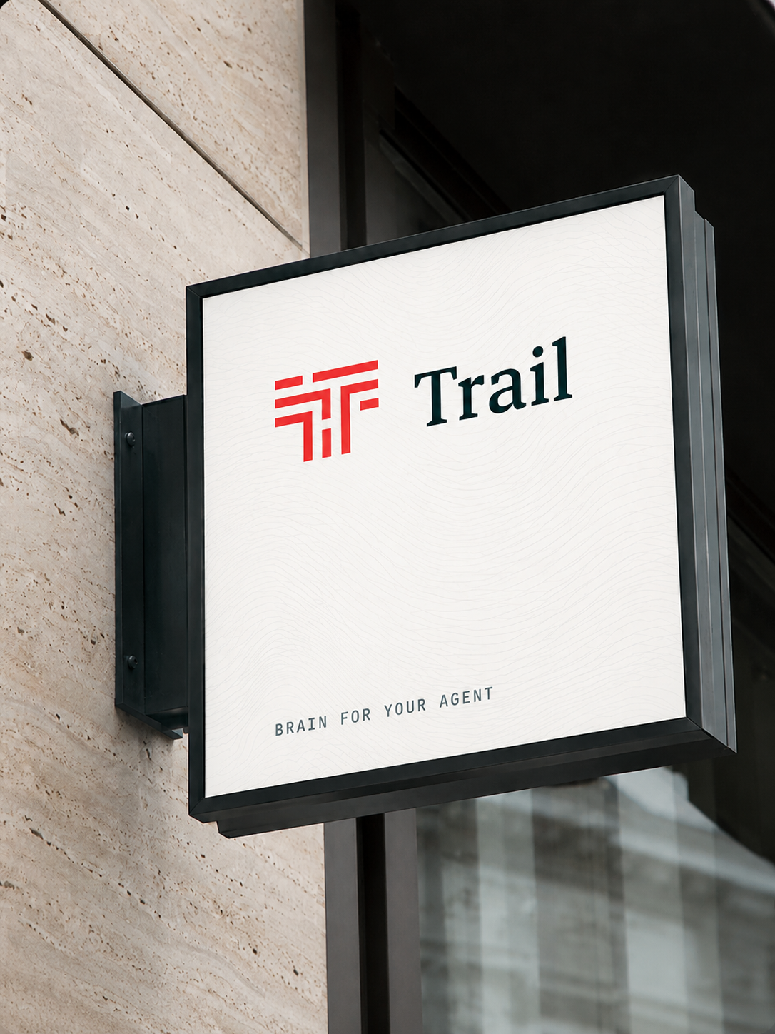
Signage, print and social all run the same three moves: deep ocean or near-white ground, the coral mark at small scale, and one idea per surface. Never place the mark on a busy photograph — give it a solid panel. The renders below are from the previous coral-on-near-black build — they are shown for layout and composition only.



Blurred, dithered, never smooth.
Gradients exist for one job: to float a product screenshot off the page. They are never a background for type, never a button fill, and never appear twice on one screen.
Do
Keep the blur heavy enough that no stop edge is findable, and let the screenshot overlap the gradient’s edge.
Don’t
Set type on a gradient, use one as a full-page background, or skip the dither — an unblurred, undithered gradient is off-brand.
Weather, not wallpaper.
Campaign surfaces get a second gradient family: long-throw, low-contrast fields built from layered radials rather than a single axis. They read as light in a room — dawn, dusk, haze — and they are the one place type may sit on a gradient, because there is no findable stop edge for it to fight.
Real screens, floated on brand colour.
Never illustrate the product — always ship an actual screenshot. Put it in a plain browser or device frame, then float it on an atmospheric mat — never a flat ocean blue panel — with the halftone dither laid over the top. The frame sits inset from the panel edge so the gradient reads as a mat, not a background.
The mat above is Duskwith the dither at 42% overlay. Swap in a real capture at 2× and let it overlap the mat’s inset edge.
Take the whole system with you.
Every logo variant, background and pattern as SVG and PNG, with the colour ramps and typeface sources in a README.